Color plays a subtle yet profound role in home improvement and renovation. Selecting the right hues can enhance the mood, define spaces, and reflect personal style. Let's delve into the world of color palettes, providing some guidance to help make these choices a bit easier.
Understanding Color Palettes
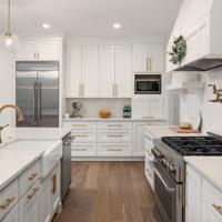
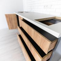
A color palette is essentially a selection of colors used in combination. It's the carefully curated set of colors that form the visual language of your home. Choosing an appropriate palette for painting and decorating can contribute significantly to the overall ambiance of your space.
Types of Color Palettes
Monochromatic
Monochromatic palettes use varying shades of a single color. By altering the lightness and saturation, you can create a cohesive and tranquil atmosphere. For example, using different shades of blue can give a room a calm and serene feel. This approach is quite forgiving if you want a subtle yet elegant look.
Analogous
Analogous color schemes involve colors that are next to each other on the color wheel. This provides a harmonious and naturally pleasing appearance. Consider using green, yellow-green, and yellow for a fresh and vibrant kitchen space. The gradation between the hues creates a smooth transition that isn't too jarring.
Complementary
Complementary palettes consist of colors that are opposite each other on the color wheel. This creates a vibrant contrast that can be very eye-catching if done in moderation. A popular complementary scheme might be blue and orange. Such combinations can make a space feel lively, perfect for a living room or dining area.
Triadic
Triadic palettes use three colors evenly spaced around the color wheel, providing high contrast while maintaining balance. For instance, a triadic scheme using purple, green, and orange can lend a whimsical and diverse flavor to a child's playroom without it feeling overwhelming.
Applying Color Palettes
When applying these palettes, it’s essential to consider the function of the space. Bedrooms, for example, often benefit from quieter tones for relaxation, while a workspace might use more vibrant colors to promote focus and energy.
Take into account the amount of natural light a room receives. North-facing rooms might benefit from warmer shades to counterbalance the cool light, whereas rooms with lots of sunlight may handle cooler shades without feeling cold.
Trends and Personal Preferences
Home design trends often influence color choices. Currently, there is a move towards earthier tones—rich browns, rusty reds, and soft greens—which bring a touch of nature indoors. However, it's crucial to choose colors that resonate personally. After all, you are the one who will live with these choices daily.
Some Practical Tips
Sample Before Committing: Paint small patches in your space to see how they interact with the existing lighting and decor.
Use a Color Wheel: This classic tool can help envision how different hues relate to one another.
Test Different Finishes: The finish (e.g., matte, gloss, satin) can alter how a color looks and feels.
Consider the Psychology of Color: Colors can evoke emotions. Blues and greens are calming, while reds and yellows are energizing.
Final Thoughts
Choosing a color palette can initially appear overwhelming, but approaching it with knowledge and an open mind can transform it into an enjoyable experience. Though it may not be the ultimate solution for every home, embracing trial and error might just lead to surprising and rewarding outcomes.
Feel free to explore various combinations and see what naturally appeals to you. After all, home improvement is as much about personal expression as it is about aesthetic appeal.
I hope this sheds some light on creating a color palette that meets your needs. If you’ve had experiences with different palettes or want to share your favorite schemes, feel free to comment below!